
Case Study: New PIX! Design
Background
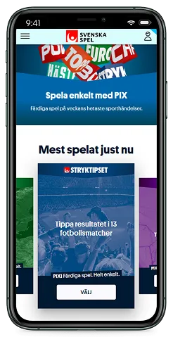
“PIX!” is a service where the customer can purchase a betslip filled out automatically. PIX! uses purchase data to determine popular choices so that the customer gets a betslip that is based on what customers at large think is likely, rather than a purely random betslip.
This is mainly targeted at beginners who may want to try out a new product but may not be too well versed with the details of the game mechanics or may not have the time to look into the teams and rosters of each match to confidently place bets.
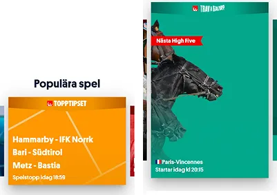
Users could buy a betslip with PIX through what was internally referred to as an advert on the home page. For clarification, no external advertisement is used on the site.
Design Process
Research
We went back to the very basics of this service: What’s the business case?
PIX! are automatic betslips, making sports betting fast and easy, so that players can jump into a game without needing to engage with the detailed mechanics of the product, which makes it easy to jump into a game when time is short or if you’re a beginner.
After this, we gathered all feedback regarding PIX! collected through the annual user survey we did at Svenska Spel.
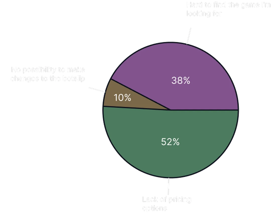
The user feedback revealed three key issues that users had:
- Lack of pricing options
- Hard to find the game they’re looking for
- No option to customize their betslip
The second and third issues were known site-wide issues and not specifically related to PIX. However, since PIX targets new customers, these issues were more relevant to this set of users.
Identifying UX Issues
Based on the feedback, we began identifying the issues causing those pain points.
The Widget
The original design had one set price per betslip. With a limited amount of advert slots on the widget, this meant that either pricing or game options had to be cut. Previously, an effort had been made to maximise the number of slots by using smaller adverts, while letting the flagship games use a larger format. This led to an overcrowded advert area which was often difficult to overview.
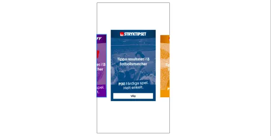
On mobile, a horizontal scroll was used instead of a grid. This design was mostly good, however, the mobile advert format was not unified as both short and tall adverts existed (though never side by side), resulting in an inconsistent experience across the site. Furthermore, the previous and next adverts were given little space next to the focus advert, reducing the visibility of the horizontal scrolling feature.
The Adverts
The adverts themselves had two key issues in their design. The text was on the adverts were all about price, with each SEK being advertised as a chance to win. This wasn’t informative for players looking to find the game they were looking for.
On the smaller adverts, the background images meant to inspire the user and communicate which sport the product focused on was given no room to fulfill its purpose.
Design Solutions
The design had to fullfill the following criteria:
- Be easily scannable
- Present relevant information to the user about the product and the sport
- Be flexible and accommodating in terms of pricing
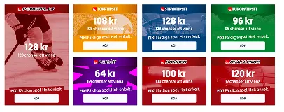
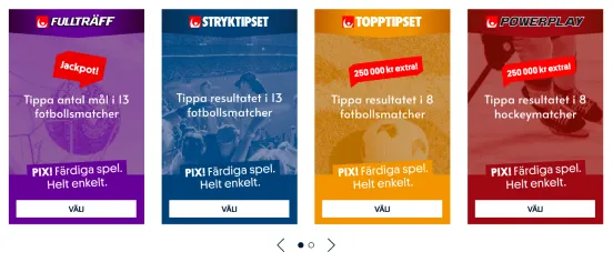
The fact of the matter was that Svenska Spel has too many products to all be shown at once. Therefore, a desktop grid of four was proposed. All adverts were using the taller dimensions as to give each advert room to fulfill its task, using pagination to allow the user to load more. This also meant that the adverts needed to be more appealing, or nobody would care to scroll for more.
Rather than displaying a price, these adverts instead used a short description of the product that also included which sport was being played, and also took greater care to make the background images more visible and more inspiring.
On mobile, the same format was used, but in a horisontal scroll through swiping, giving more room to the previous and next advert to increase visibility.
New Features
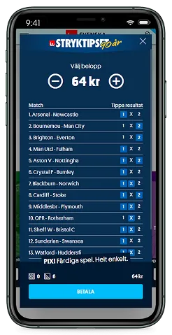
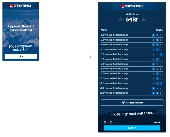
When a user clicked the “Choose” CTA button, the betslip would appear as a modal.
In this stage, we added controls so that the users could select the price amount. Given the logic of the products, there were only about five price points available, each generating a different kind of betslip.
Users could therefore easily navigate the different price points and immediately see how the betslip changed as they did so, giving them beginners a better understanding of the game while at the same time allowing the users themselves to decide what price was right for them.
Evaluation and Iteration
Given that PO and stakeholders felt confident with the design, we decided to use A/B testing on the production site to evaluate the design solution.
In short, the new PIX design generated 18% more advert clicks compared to the old and 5% more purchases.
One key takeaway was that while users could freely choose their own price points, a majority was happy to purchase the default option, which was usually somewhere in the middle. Products that had a higher default price point saw a revenue increase whereas product with a lower default price saw a revenue decrease. It was clear that more testing was needed to determine which price points were a good default for each product.
We also started sketching some proposals to meet customer demands in more and better ways, such as filtering the adverts based on what sport was played and personalizing the copy in the adverts based on player experience. These proposals would go into the team backlog as more tests were being done.