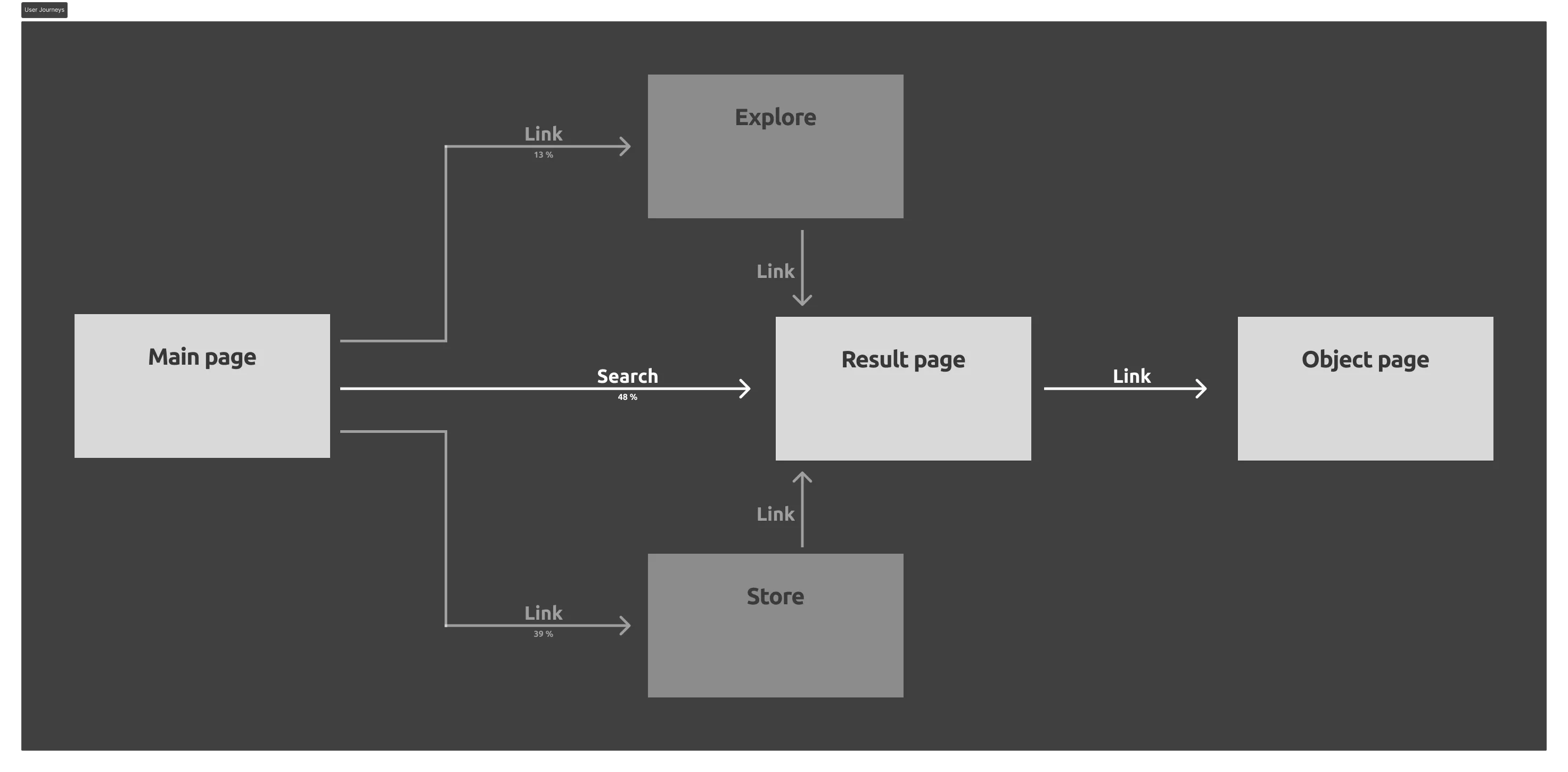
Exploration Journey: Search
Background
This project’s goal was to increase organic conversion, specifically looking at the Search function’s role in the users’ exploration journeys.
Users want an easy way to browse the items based on their search terms to find what they’re looking for. We also wanted paid objects to be shown priority over free objects, to increase the conversion of paid items, specifically.
The first step was to understand how the users used the search function and to what end. We conducted a user survey with roughly 50 respondents and also conducted user interviews with eight of them.
Roughly 75% of users used the search function as a way to explore the range miniatures, while the remaining users wanted to find a particular miniature.
Identifying UX Issues
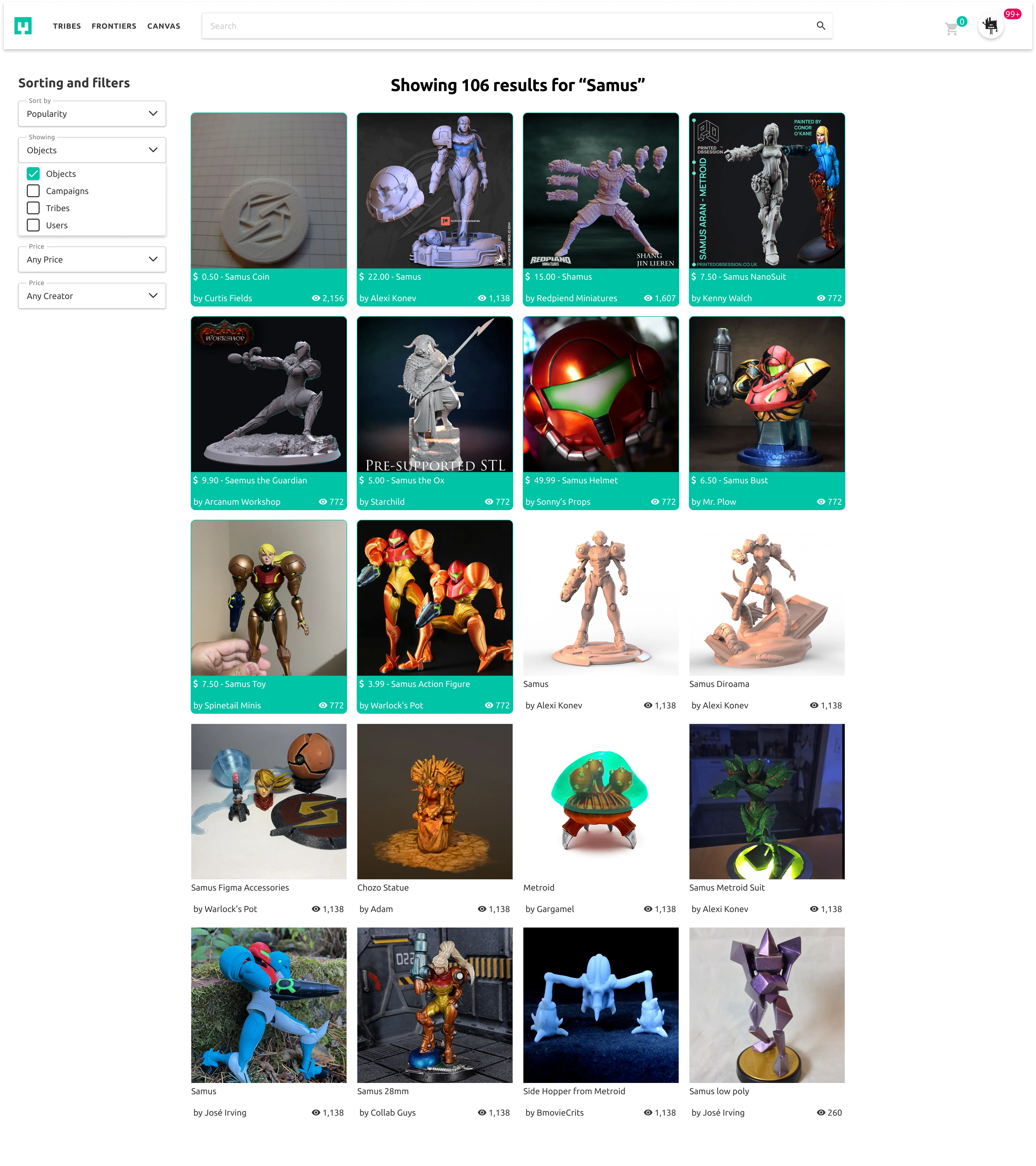
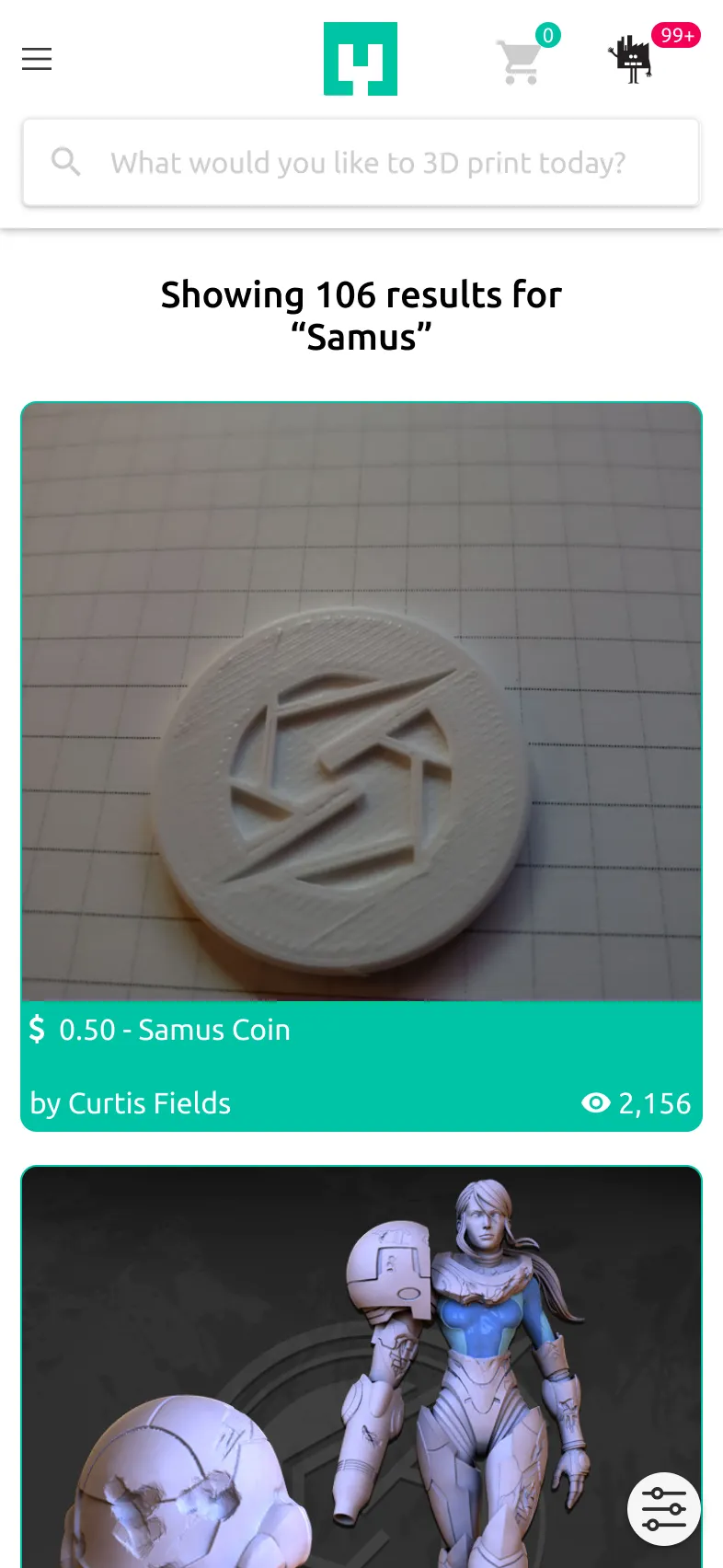
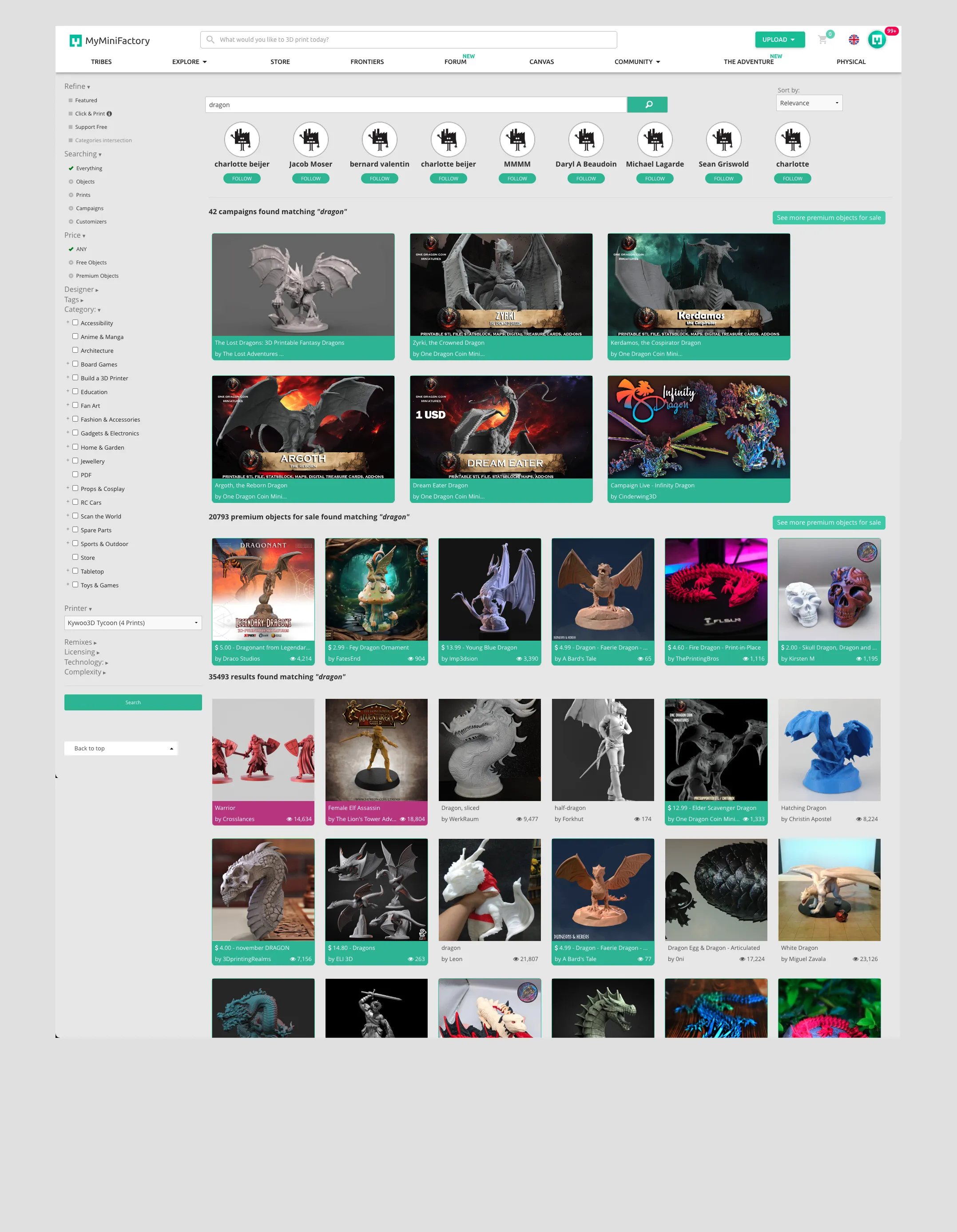
In the example to the right, we’ve searched for the term “Dragon”, which is a very common term with over 35 000 results. The original design displayed multiple categories at once, with some categories only being displayed as previews and all following different formats. Finally, premium objects are displayed as a category but is also mixed in with the overall “result” category, which also highlights some microcopy issues.
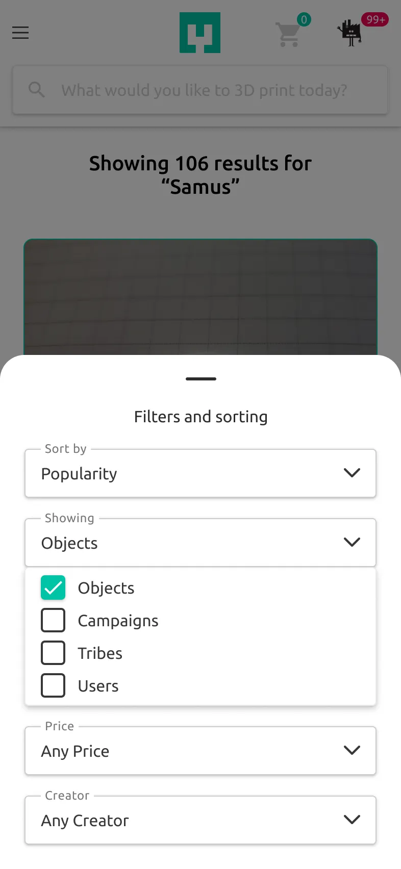
The second feature that needs an overhaul is the Sort and Filter function. The filter has high visibility on the left but suffers from option bloat. There’s too much to choose from with no thought put into what metrics users value. The sorting drop-down is much better in this regard, but it’s not very visible, sitting to the right of the search bar.
Results
Our A/B testing showed an 8% increase in purchases from search. We also found that users spent an additional half a minute on the search page on average. Initial follow-up data indicated that this was due to users finding more relevant items, as purchases were still made after longer durations.
During follow-up interviews, one contributing factor was prioriting premium items, which were often perceived as high value or high interest, meaning the users had to sift through less “junk”, as one user put it.
Overall, the design changes were well received by the site’s users.