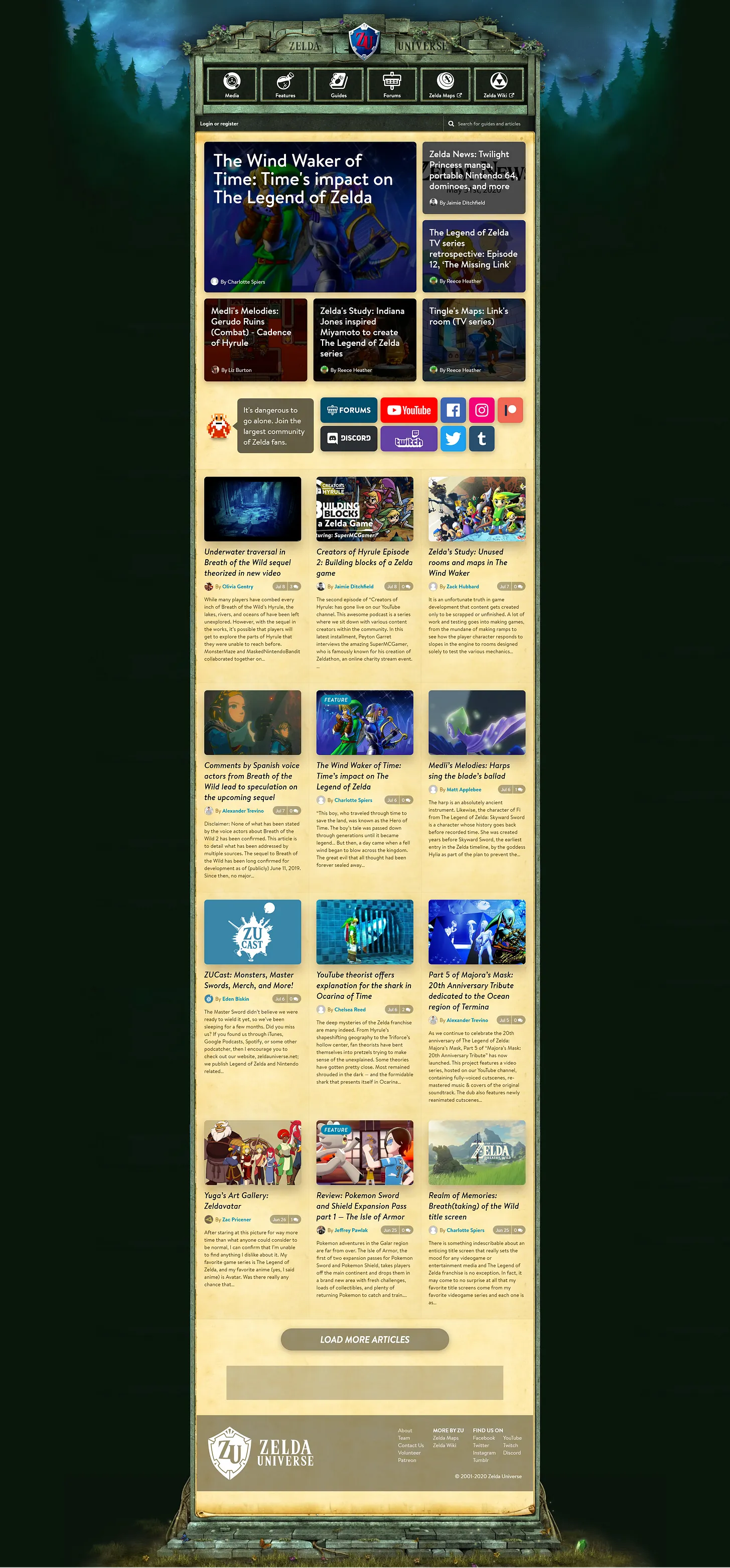
Zelda Universe
Zelda Universe was the first website I worked on and it’s special in many ways. As the largest Zelda community on the web, we wanted the website to have the look and feel that instantly let Zelda fans know that they’ve found home. Everything from the forest backgdrop and the temple header to the parchment content background was carefully selected to reflect the aesthetics of the Legend of Zelda franchise, while also being unique in the sense that it’s not taken directly from any one game, though definitely inspired by entries like Ocarina of Time and Twilight Princess.
On this project, I mainly worked on low and high fidelity mockups putting a lot of focus on layout, buttons and featured content. You can view an early drawing of this webiste here.
I was fortunate enough to work with a wonderful team of a half dozen people. As lead designer I was overseeing both the visual aspects and some of the backend development.
Although the current site has changed to be more in line with Breath of the Wild’s visual identity, it still uses the foundations we made almost a decade ago.
